Why Minimalist Merch Appeals to Leftovers Fans
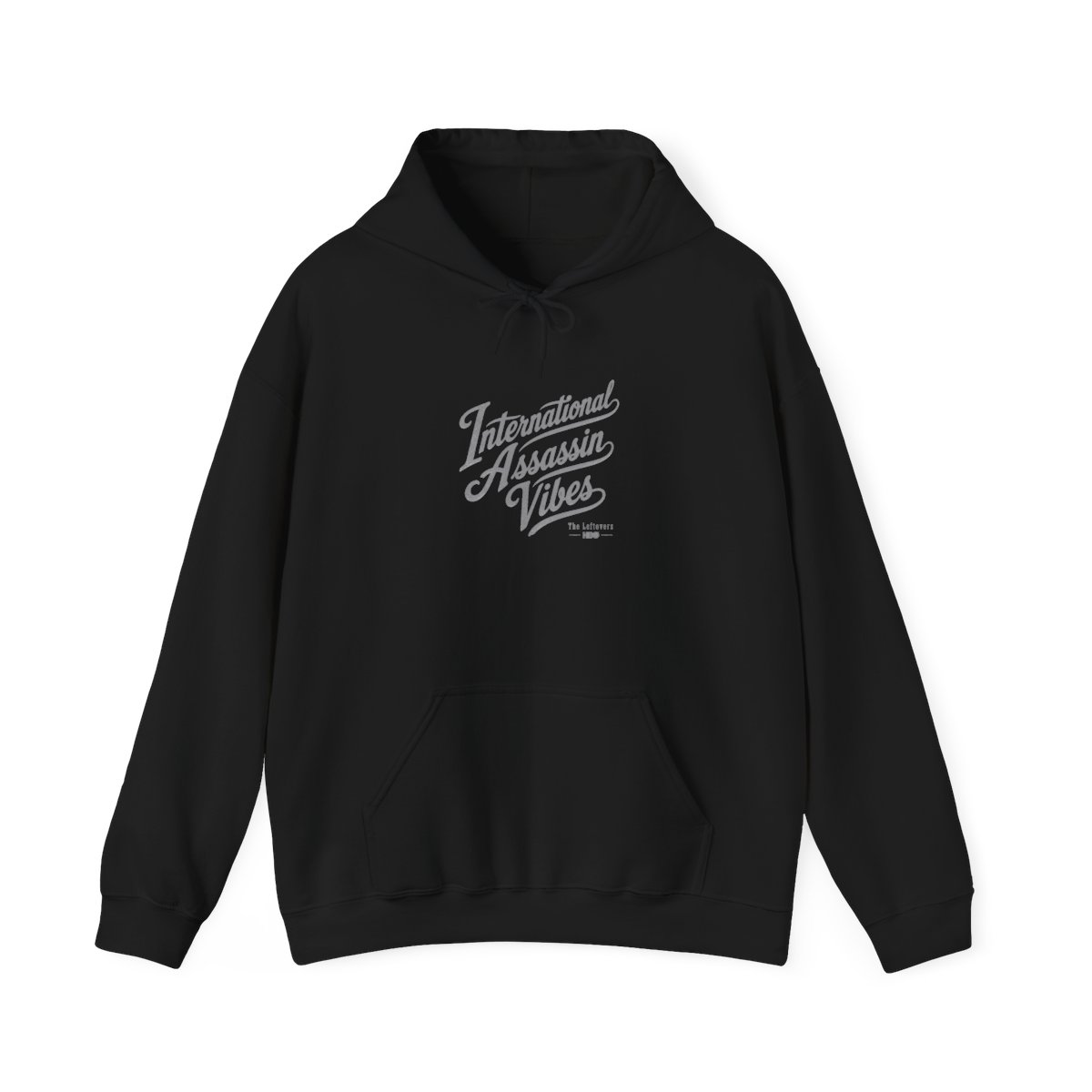
Most TV show merchandise screams fandom from across the room. The Leftovers minimalist merch does the opposite - and that's exactly why fans love it. The show itself is a masterclass in understatement: quiet grief, ambiguous departures, and moments of grace hidden in plain sight. Your wardrobe can reflect that same subtle depth.
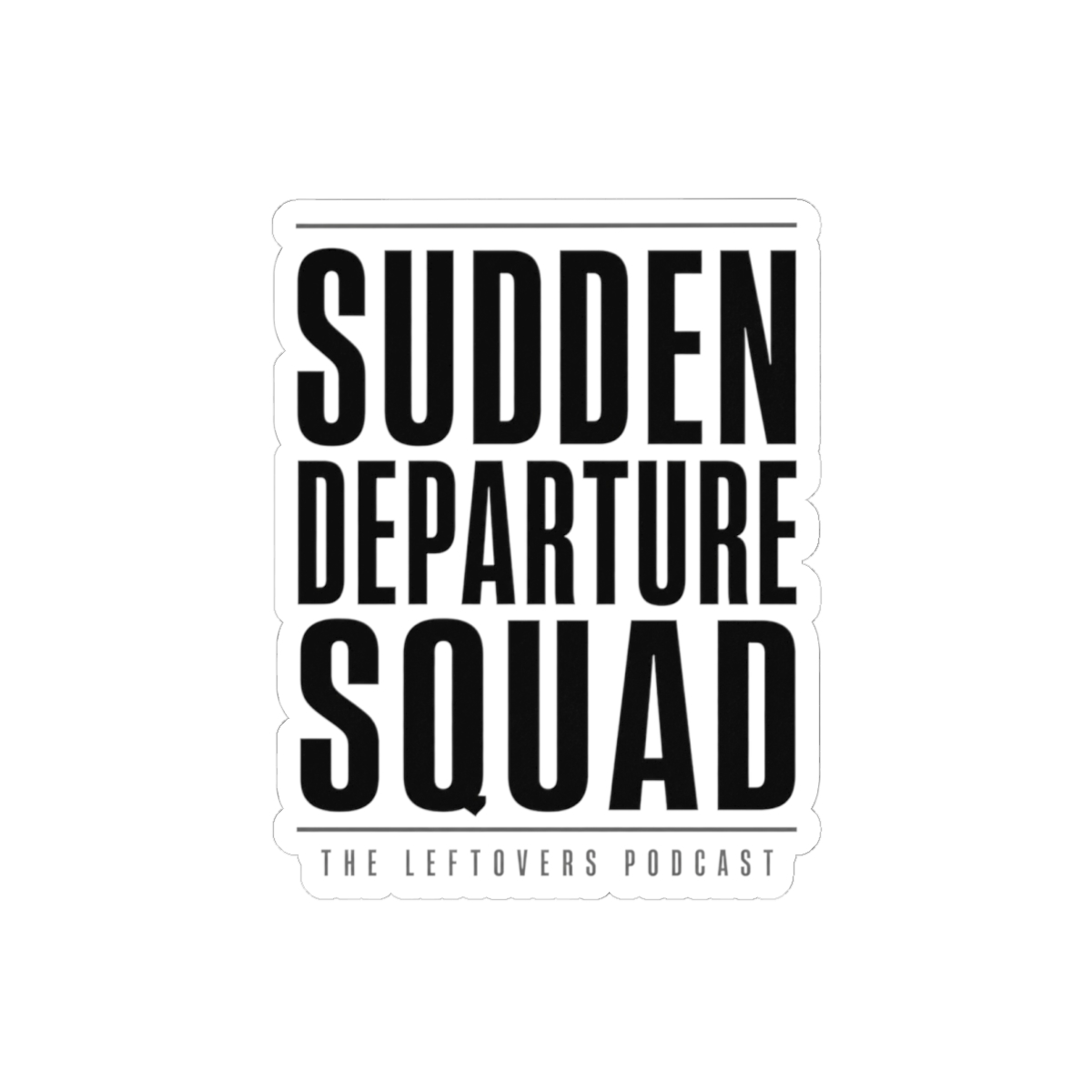
Minimalist designs strip away noise. They let the symbol do the work - a single fork, a faded map of Miracle, the word "Departure" in a clean sans-serif. For fans who prefer a nod over a neon sign, this merch delivers connection without shouting. I've seen this trend across dozens of fan communities: the most engaged members often reach for the most restrained designs.
The Psychology of Subtle Fandom
Wearing a minimalist piece is like being in on a secret. Another fan might catch the reference and share a knowing smile. That shared understanding builds community without awkward fanfare. The Leftovers explores themes of belief, loss, and mystery - a loud logo just doesn't fit. Clean lines and muted colors honor the show's tone.
What Makes a Design "Minimalist"?
- Single-color prints on neutral backgrounds (black, heather grey, navy)
- Small, centered graphics (chest-sized, not full-front)
- Typography-driven designs with subtle references
- No episode quotes or character photos - just symbols
These pieces work with your everyday wardrobe. You can wear them to the office, to coffee, or on a hike. They don't scream "I watched a heartbreaking HBO drama" - they whisper it.